Welcome to Part 8 of the WebWiskee Success Series. We’re talking about optimizing your images so both Google and customers can find you, and checking your color combinations for the best readability to make sure you’re in compliance with the ADA (the American Disability Act).
This content is designed to prepare you for the technical build of your WebWiskee website. If you missed Parts 1 – 7 we’ve linked to them at the end of this post, so you can catch up.

When it comes to images, it’s important to help Google understand what it’s looking at. Since search engines can’t watch your videos or look at your photos—they can only read the text that you associate with them. Just like you optimize your website’s copy for search engines, we’re going to walk you through optimizing your images.
Keeping Organized
Let’s start off with some best practices. Just like cleaning your office before you start a big project, keeping your website assets organized will make your website build go so much more smoothly.
Let’s start with WHERE you’ll keep your photos:
You can store them directly on your computer of course, and that’s fine if you’re a solo-preneur and don’t have anyone else who might need access to them.
But if you’re a growing business, you will likely have team members who need access, and you’ll probably want to have cloud based storage. There are lots of services out there, but the two biggies are Dropbox or Google Drive. Either of these services can provide ample storage and can grow with your business.
As far as HOW you organize your images:
We recommend a main “Website” folder, and sub-folders within that. Sub-folders can be for your various pages, your copy, your logo suite, optimized images, icons and graphics.
WHY IT MATTERS: Keeping your image, icon and text files in organized folders will keep everything for your website in one place, and help the build go more smoothly.
Trust us when we tell you that setting up a simple organizational structure today will save you countless headaches tomorrow when it comes to building your site and updating your content in the future.

Naming Your Photos
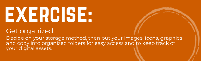
It is important that your image files are all properly named, but what’s a correct name? Well, knowing what we know about the importance of keywords, and that Google can ONLY read text, which of these photos will make more sense to Google?
Photo #2, of course! If you’ve ever done an image search, the only reason there are photos that show up in the search results is because someone took the time to properly assign text to that photo.
As you gather images, whether straight out of your camera roll, or from stock photo sources, take the time to rename them something that will make sense to Google. If you can incorporate keywords into the image’s file name, that’s even better.
WHY IT MATTERS: Since Google can’t look at the photo, it can’t “see” it unless you describe it. Plus, it’s another opportunity to let Google know more about your business and your website.
Resizing Your Images
Big, beautiful images can take your website from “just ok” to gorgeous. It’s important to make sure your images are the right size and quality for the web. Both visitors and Google expect websites to be fast.
A photo that is too big can take a long time to load on your website. A photo that’s too small might load quickly, but it doesn’t look good for visitors and can degrade the quality of your visitor’s experience (and it can make your company or brand look cheap).
You should always start off with a larger size photo. It’s ok to take a large photo and make it smaller, but taking a small photo and trying to make it larger never works.
Start with good sized photos and resize them if needed. For a full screen photo on a desktop you will want your photo to be between 1500 and 2500 pixels wide. If you need smaller photos, you’ll want to resize the large photo to the size you need. You may not know the exact size you need until you begin building your site, but when it’s time to resize them, here’s a handy, free tool you can use.
By properly resizing images as needed, browsers can load images much more quickly, having a positive impact on your visitors’ experience as well as your SEO. (Google doesn’t like slow websites.)

What’s The Difference Between Resizing and Compressing Images?
Compressing a file is a way to fit more data into the same space. If resizing is about the pixels, then compression is about reducing extra space. Anyone who has ever needed to squeeze all of the air out of a Ziploc bag or needed to scoot their chair over to make room for another person at a table knows that you aren’t adding additional space, you’re reducing wasted space.
Going through the hassle of resizing and renaming images can be annoying and slow down your efforts to quickly write a blog post or make changes to your website. We recommend using this easy workflow for image management that you can repeat every time you build a blog post or web page.
- Select your image
- Resize it if needed
- Rename your image using a keyword appropriate name
- Put the image into your Optimized Images folder
Starting off your build with these easy best practices will help the site load more quickly. No one wants a pokey website.

What Is ALT Text?
If image searches are so important, how do you teach Google what your images look like, and what the heck is ALT text?
This refers to Alternative Text, and is also known as ALT attributes, ALT descriptions, or Alt tags. In short, it’s used within your image’s HTML code to describe the appearance and function of an image on a page.
That sounds a bit nerdy, right? Here’s an example that might help.
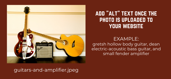
The photo file name is pretty basic, but the ALT text is more descriptive as to what is actually in the photos and can provide a bit more detail to Google. A good rule of thumb is to simply describe what is in the photo.
This will help with ADA compliance as well. Let’s talk about that next.

Accesibility
Remember how Google can only read text, it can’t look at photos? Visually impaired visitors to your website use assistive technology that can read the page aloud to them. Just like Google, that technology can’t look at images or watch videos… it can only read the text associated with them.
ADA (Americans with Disabilities Act) is the law that prohibits discrimination against people with disabilities in all public and private places that are open to the general public. This now includes websites.
NOT complying with ADA by making sure your website is accessible to everyone can get you into big trouble—and by big trouble, we mean you can get sued or fined for non-compliance.
But being compliant isn’t just about avoiding a lawsuit, it’s about making sure that everyone can access and use your website. Proper use of ALT Text means that Google loves you AND your site is accessible for all visitors. Win-win! Who wouldn’t want that?
Where do you put the Alt Text? When you upload a photo to the media library on your WebWiskee site you’ll see a field where you can add in the description of your image. Here’s what it looks like when we put it all together for a small photo we used for a blog post.
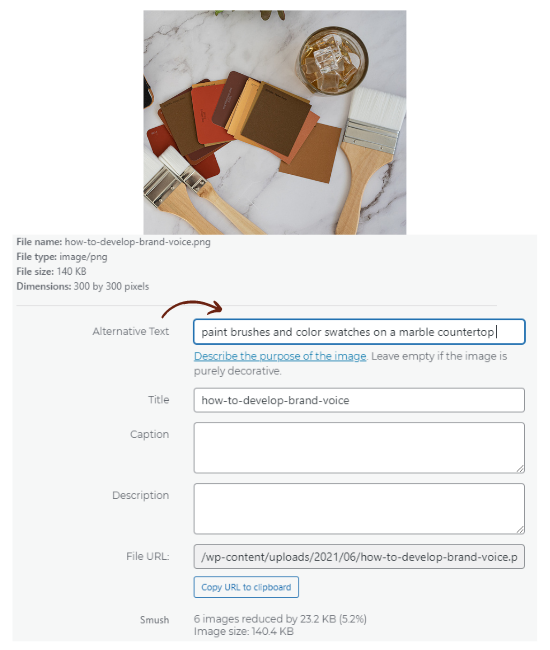
What should you write in your ALT Text? Simply describing what is in the picture will give you what you need. For example, “Woman in Mermaid-cut Bridal Gown designed by Vera Wang,” or “Businessman crossing the street with briefcase” will do just fine. If you can make it a keyword rich description, all the better, but the priority is to describe the photo.
WHY IT MATTERS: Both Google and people who are visually impaired and need images described through keyword-rich ALT Text. It’s another opportunity for your business to be found when doing a Google image search, and the best way to comply with the law.
Color Combinations for Readability and ADA Compliance
Image descriptions aren’t the only part of your website that needs to keep ADA compliant. Color combinations also matter when it comes to readability. Putting a light colored text on a light colored background will not be readable to most people. It’s all about the contrast.
In our last email, we gave you resources for choosing your branding and website colors. You can definitely use all your colors in part of your site, images and graphics, but be aware of how you are combining them for ease of readability.
Here are some of WebWiskee’s brand colors in combinations which DO NOT work together for readability.
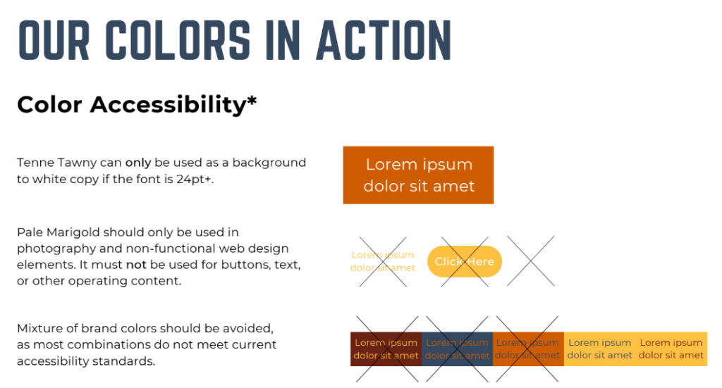
You can see that contrast is so important for readability. There’s a reason books are black and white. Putting white words on a yellow background will not provide enough contrast to be readable.
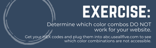
One of our favorite tools to determine which color combinations are accessible is UseAllFive. This website can take your color palette and let you know which colors work together, and which don’t when it comes to ADA compliance.
Take the hex codes from 3 of the colors you chose during the color palette exercise, as well as #000000 (black) and #FFFFFF (white) and plug them into this website to generate your report.
WHY IT MATTERS: Make sure that everyone can read your website.
We’ve covered a lot of ground today, and some of it isn’t very fun. No one likes to think about potential legal issues, but it’s important to ensure that everyone—including Google—can “see” your website.
In our next post, we’ll help you outline your site map so that you know which pages you’ll need to build out, as well as tips for moving your visitors through their customer journey.
If you missed any of the posts and exercises to prepare you for your website build, be sure to catch up!
The WebWiskee Success Series
WebWiskee Success Series Part 1 – Targeting Your Ideal Customer
WebWiskee Success Series Part 2 – Your Business’s Super Power
WebWiskee Success Series Part 3 – Keywords: The Key To A Successful Website
WebWiskee Success Series Part 4 – How To Write Your Website Copy
WebWiskee Success Series Part 5 – How To Craft Your Customer Journey
WebWiskee Success Series Part 6 – How To Write Your Story
WebWiskee Success Series Part 7 – How to Choose your Website’s Color Palette and Photos
WebWiskee Success Series Part 8 – How To Optimize Your Photos For SEO and Accessibility
WebWiskee Success Series Part 9 – How To Develop Your Website’s Sitemap